A rebrand for a neighbourhood sandwich shop.
Client
Loafers
year
2026
role
Brand Identity
Project Description
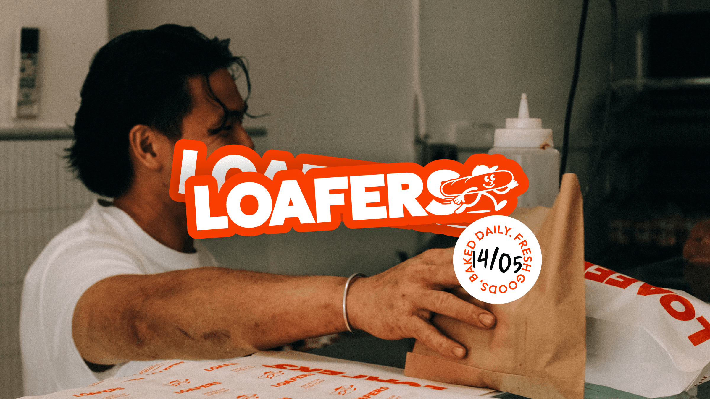
Loafers is a sandwich shop that makes the kind of food worth walking across town for. The business had outgrown its original brand — inconsistent across touchpoints, a bit timid for a place with this much personality, and missing the kind of identity that sticks with people. They needed a rebrand that could carry the feel of walking in the door: fast, friendly, and confidently everyday.
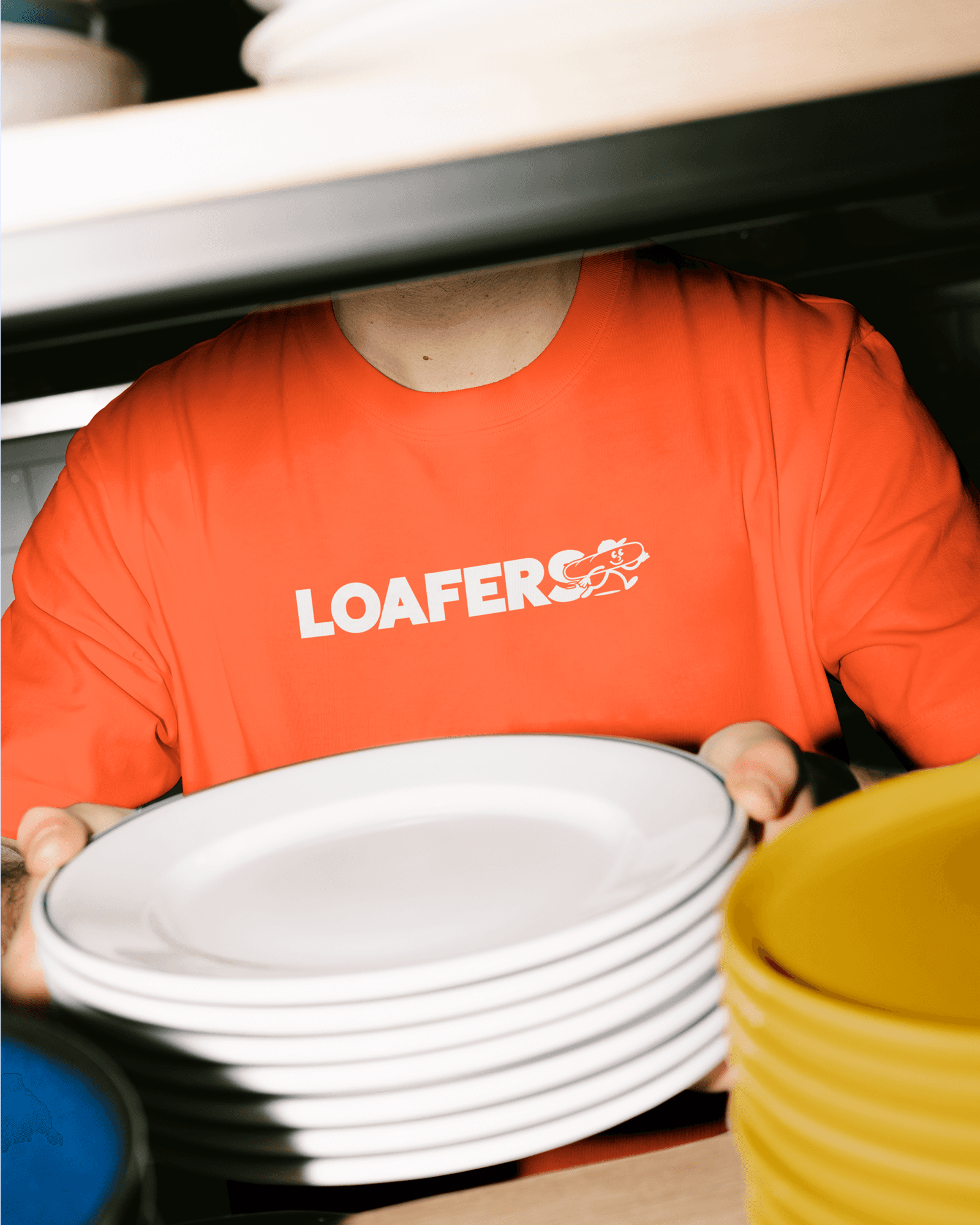
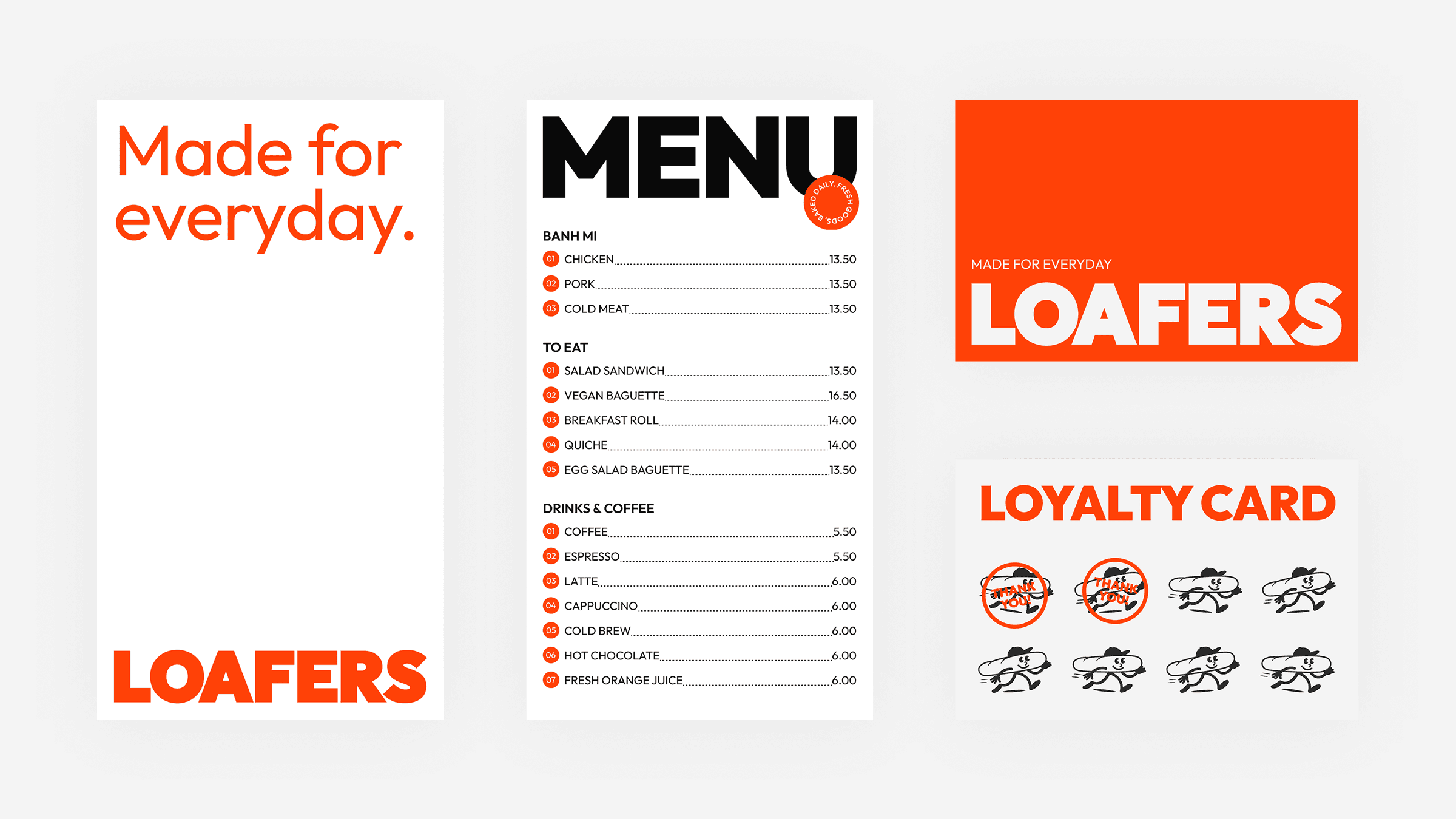
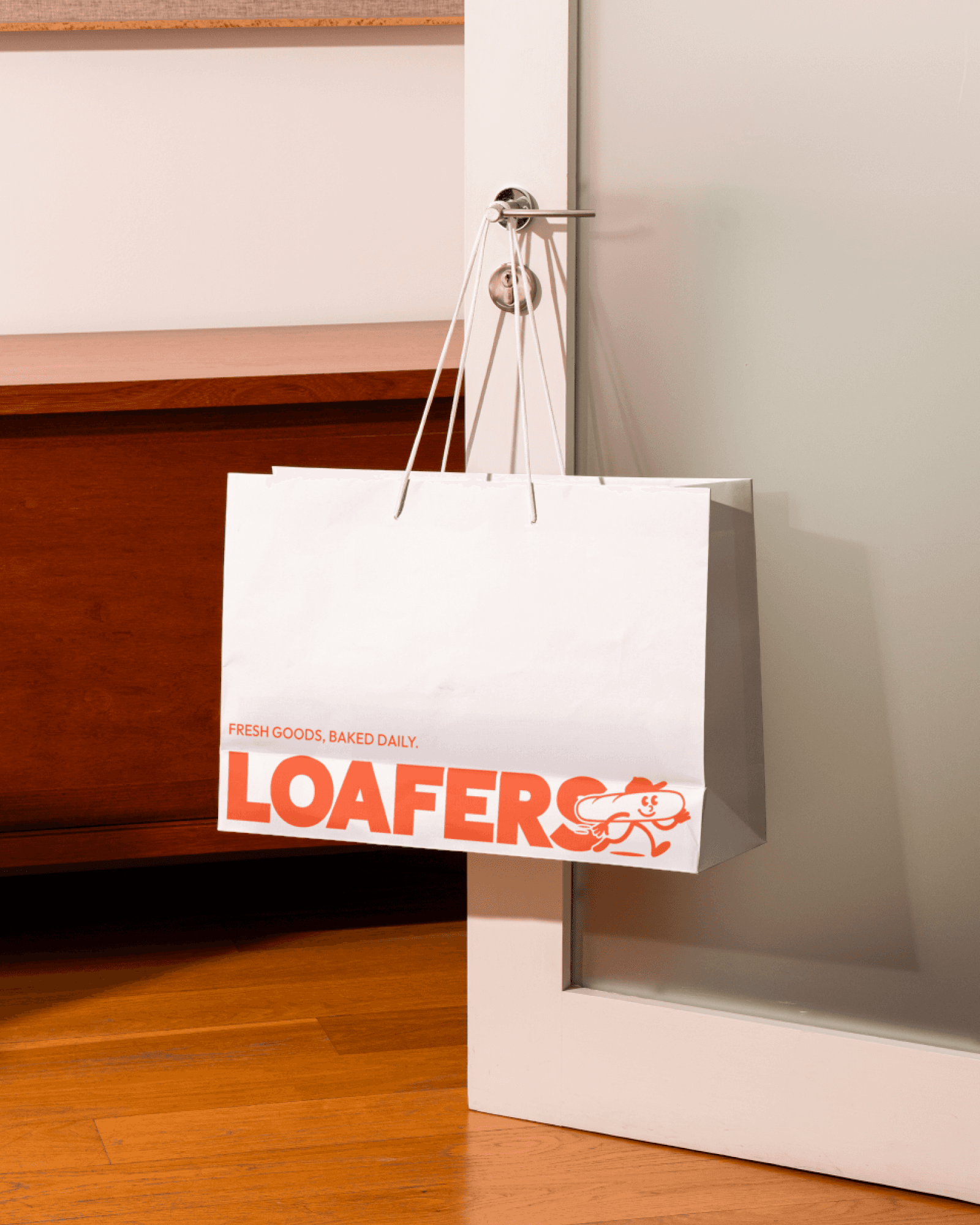
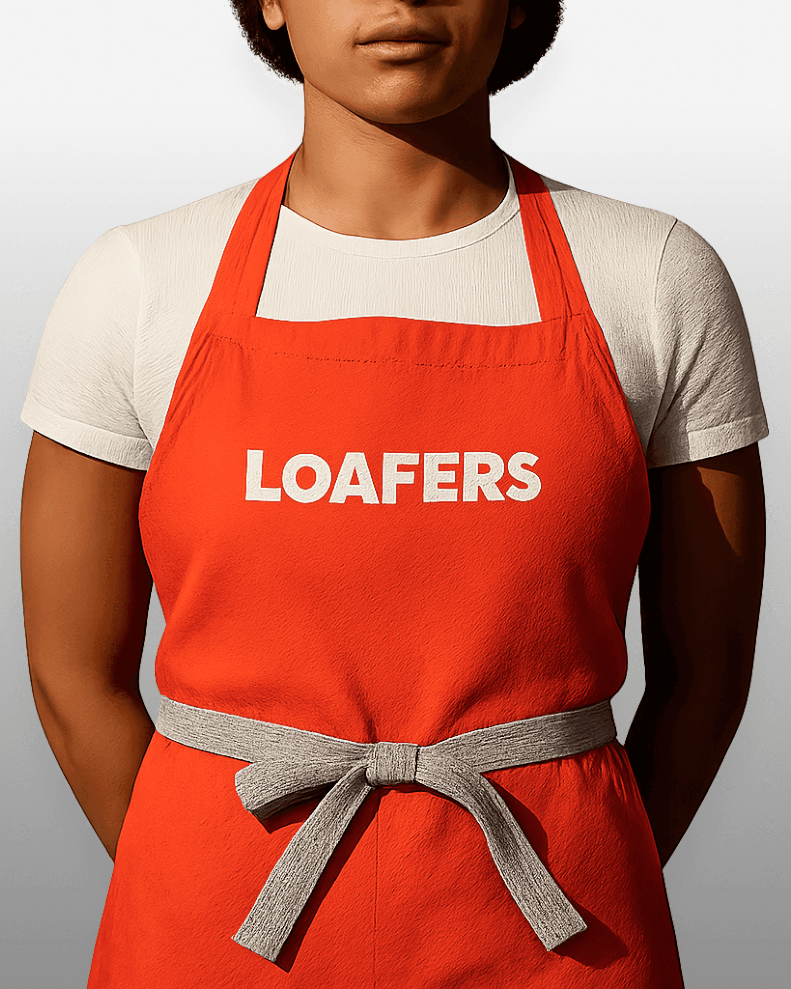
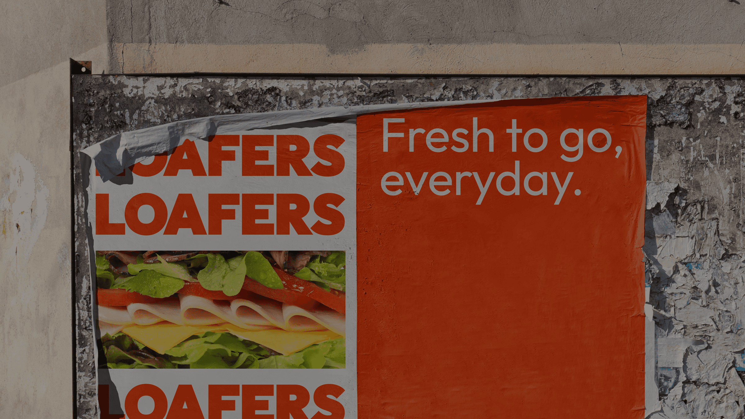
We leaned into what Loafers actually is — a local spot that doesn't take itself too seriously but takes its food seriously. The new wordmark pairs a chunky, grounded logotype with a hand-drawn mascot — a sandwich-riding cowboy — that gives the brand its character. Orange is the hero colour. Outfit carries the type system from headlines down to menu prices. The system was built to stretch across packaging wraps, menus, signage, aprons, loyalty cards, and a loose family of stickers and posters that keep the brand feeling alive rather than locked down.
A brand with a voice you can hear before you order. It runs across the shop, the packaging, the uniforms, the digital menu, and the neighbourhood posters. Honest food, honest brand, nothing overworked.