Booking now
2 spots left
Booking now
Loafers
A rebrand for a neighbourhood sandwich shop
Brand
Print & Packaging
E-Commerce



Mate, we fucking love it. So happy with how it has all turned out!
Brendan
Owner
Info
Outgrowing the first brand
Loafers is a neighbourhood sandwich shop that makes the kind of food worth walking across town for. The business had outgrown its original brand: inconsistent across touchpoints and too timid for a place with this much personality. They needed an identity that could carry the feel of walking in the door.
A wordmark, a mascot and a lot of orange
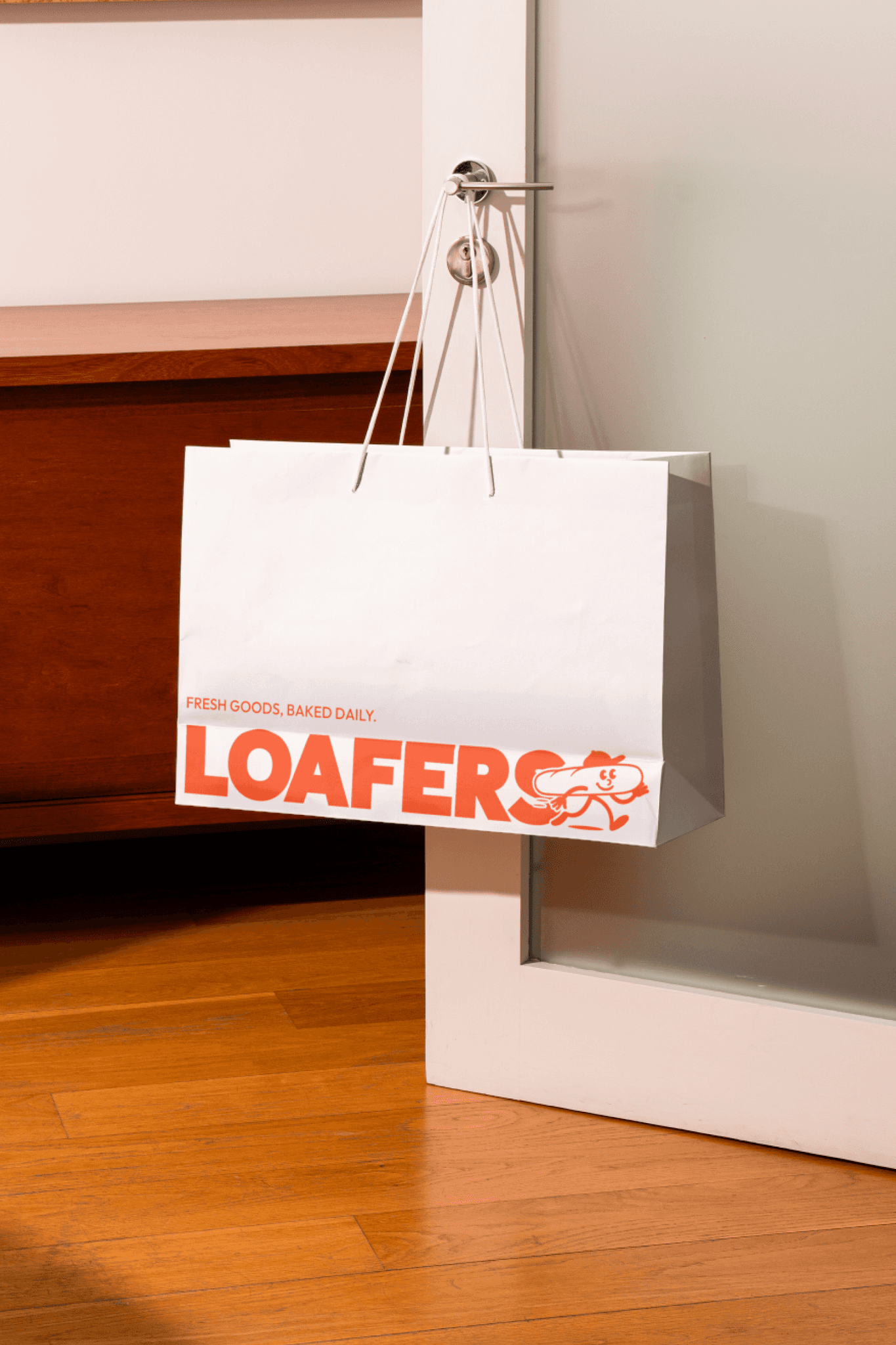
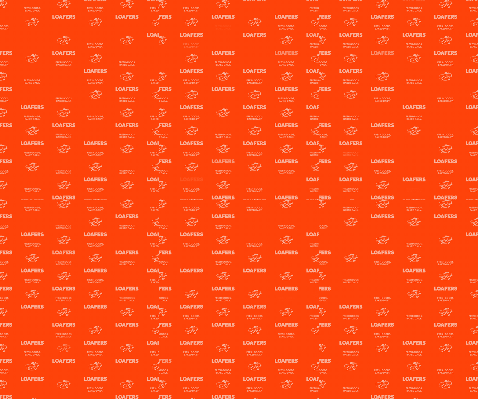
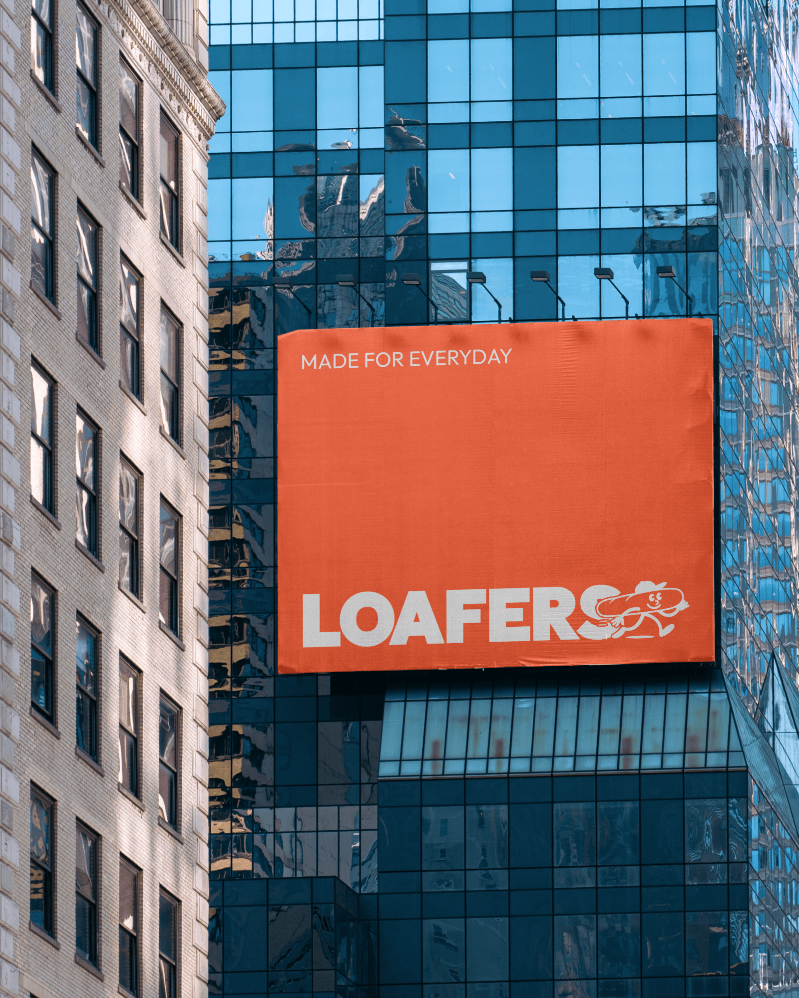
The new wordmark pairs a chunky, grounded logotype with a hand-drawn mascot that gives the brand its character. Orange is the hero colour, and Outfit carries the type from headlines down to menu prices.
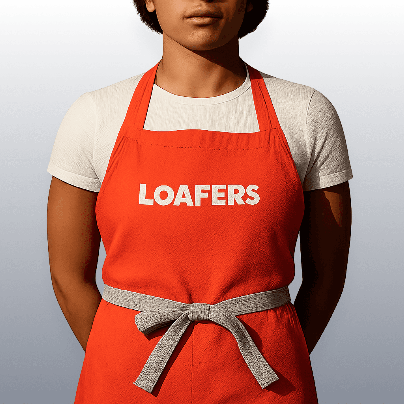
The system stretches across packaging, menus, signage, aprons, loyalty cards and a loose family of stickers and posters that keep it feeling alive rather than locked down.
What’s next
The brand now runs ahead of the shop’s next chapter. An online store for their sauces, pre-orders before stock lands, and a full shopfront renovation landing early 2027, rebuilt to match the brand inside and out.
Client
Loafers
Industry
Food & Drink
Year
2026
Loafers
A rebrand for a neighbourhood sandwich shop
Brand
Print & Packaging
E-Commerce
Mate, we fucking love it. So happy with how it has all turned out!
Brendan
Owner
Info
Outgrowing the first brand
Loafers is a neighbourhood sandwich shop that makes the kind of food worth walking across town for. The business had outgrown its original brand: inconsistent across touchpoints and too timid for a place with this much personality. They needed an identity that could carry the feel of walking in the door.
A wordmark, a mascot and a lot of orange
The new wordmark pairs a chunky, grounded logotype with a hand-drawn mascot that gives the brand its character. Orange is the hero colour, and Outfit carries the type from headlines down to menu prices.
The system stretches across packaging, menus, signage, aprons, loyalty cards and a loose family of stickers and posters that keep it feeling alive rather than locked down.
What’s next
The brand now runs ahead of the shop’s next chapter. An online store for their sauces, pre-orders before stock lands, and a full shopfront renovation landing early 2027, rebuilt to match the brand inside and out.
Client
Loafers
Industry
Food & Drink
Year
2026
Loafers
A rebrand for a neighbourhood sandwich shop
Brand
Print & Packaging
E-Commerce
Mate, we fucking love it. So happy with how it has all turned out!
Brendan
Owner
Info
Outgrowing the first brand
Loafers is a neighbourhood sandwich shop that makes the kind of food worth walking across town for. The business had outgrown its original brand: inconsistent across touchpoints and too timid for a place with this much personality. They needed an identity that could carry the feel of walking in the door.
A wordmark, a mascot and a lot of orange
The new wordmark pairs a chunky, grounded logotype with a hand-drawn mascot that gives the brand its character. Orange is the hero colour, and Outfit carries the type from headlines down to menu prices.
The system stretches across packaging, menus, signage, aprons, loyalty cards and a loose family of stickers and posters that keep it feeling alive rather than locked down.
What’s next
The brand now runs ahead of the shop’s next chapter. An online store for their sauces, pre-orders before stock lands, and a full shopfront renovation landing early 2027, rebuilt to match the brand inside and out.
Client
Loafers
Industry
Food & Drink
Year
2026


Plenty Good Studio
Brand + Product Design
© All rights reserved
Plenty Good Studio
Brand + Product Design
© All rights reserved
Plenty Good Studio
Brand + Product Design
© All rights reserved